Why document a site architecture diagram?
A nicely documented site architecture diagram can give you a complete enough view of your current site map for you to identify any potential problems with page rank flow, pages with very low levels of internal links and content too many clicks away from your homepage. It can also make you think differently, and (for me anyways) anything that inspires me to think differently about something I’ve done the same way for a long time is a good thing. By creating a diagram of your site, you can solve existing problems, add links to flatten your site architecture and you can always use your work later on to plan for a better site redesign.
Graphviz
One of the first tools I came across was Graphviz, a piece of software (with its own language) designed to represent “structural information as diagrams of abstract graphs and networks”. Bottom line is, if you can get your head round the language, DOT, then you should be able to produce some amazing architecture diagrams like this (click to enlarge):
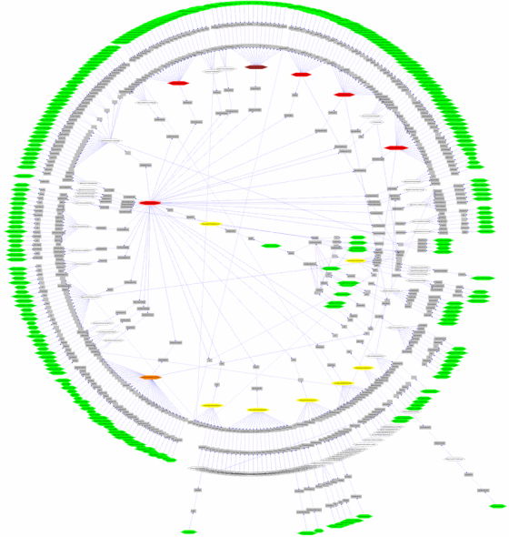
I really liked the way the deeper content surrounds the homepage at the centre, rather that the homepage sitting at the top of the diagram. Pagerank doesn’t flow “down” your site architecture, it’s distributed around it. Cool.
Using Graphviz is rock hard though – you’ll need some patience to produce something like the diagram above. There’s a lot of messing around learning DOT, which is a very simple language but requires some further code driven tomfoolery to get the design / layout of the visual just right. To make life apparently easier, Xenu’s link sleuth supports an export file type compatible with Graphviz, thanks to contributor Kevin Niehage but, every export I did ended with hilarious (crash related) results.
Visio 2007
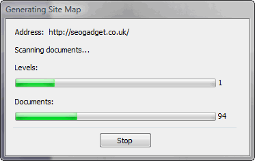
Perhaps a little less exciting, but far simpler is Microsoft Visio. Visio actually crawls your site, and generates a site map, just like that! Admittedly, the first results tend to be a bit useless, but with the discovery of the list view toolbar, you’re set:
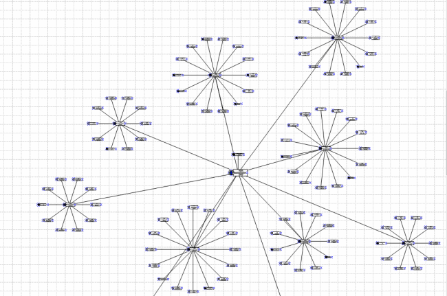
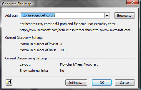
The process of mapping a web sitemap in Visio is simple – here’s the step by step:
- Open Visio and select networks > web site map – the dialogue that appears looks like this:
- Click ok (there are some settings to play with, but let’s not cover those – you don’t need to change much, if anything):
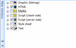
- Use the Filter Window to select filetypes you’d like to exclude eg: css files, gif’s and javascript files:
On sites of a reasonable size, you can produce something visually appealing for your clients quite quickly.
Nicheworks
Some of the most impressive visualisation tools I found out there seem not to exist any more – Nicheworks being a good example. According to this site:
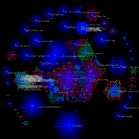
Nicheworks is a interactive tool for visualising massive networks with hundreds of thousands of nodes. It was developed by Graham Wills at Bell Labs. The screen-shots here show Nicheworks visualisation of the network structure of a large Web site.
Check out the graphics produced by Nicheworks (Click to enlarge):
WebTracer2
By far the coolest visualisation tool of them all is WebTracer2. According to their homepage:
WebTracer is an project based on the intention to visualise the structure of the web. There are many applications that analyse websites for structural integrity and diagnostic purposes, but few reveal the visual structure that web hypertext creates. Webtracer represents this structure as a three dimensional molecular diagram, with pages as nodes(atoms) and links as the strings(atomic forces) that connect those nodes together.
Check out these visuals (click to enlarge):

These images are not static! In fact, they’re interactive. Webtracer is a really exciting piece of visualisation software, so how do you make a pretty picture like this?
The way the tool works is incredibly simple. Download the WebTracer2 ZIP file and extract it to a directory somewhere on your PC. Open the “Spider” application and enter your URL, like this:
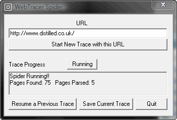
The spider sets about crawling, ready to be told when to save its data in the /Maps subdirectory. The crawl isn’t too aggressive – one or two pages per second is quite reasonable. I’d love to take the crawler for a spin on one of the big sites I work with when I have the time to allow for the crawl.
Once you’ve crawled your site, click the “Save Current Trace” and go back to the directory you extracted the ZIP file to. In there you’ll find another executable called “Visualiser”. Run the EXE and follow the on screen prompts to find your newly created map file.
The two, double helix like chains of spheres running through the middle of the space are pages linked to frequently, typically navigational elements. There are other, smaller chains of spheres which seem to be the most recent posts. From there, the spheres (nodes) decrease in size the less often they are linked to. Typically the least linked to nodes sit on the outermost periphery of the space. These are the pages / posts that I don’t mention very often (if at all) so most likely they’re linked to from one or two category pages at the most.
I really like the way you can mouse over the different spheres to find out their URL – great for exploration and a good way to kill some time, too.
Other (surprising) inspirational sources: Flickr
Thanks to finding a very similar discussion to this post on Peter Gaston’s Broken Links I quickly found some interesting ideas posted by the good folks on Flickr:

photo credit: netfuel
Peter’s favourite “hard to beat” method of sitemap creation was simply to put your pages up on the wall:
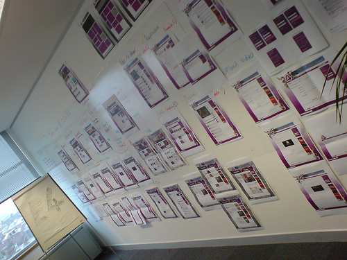
photo credit: jimbola
There’s much inspiration left to discover
Just by looking around the internet and discovering some of these applications, I quickly began to realise the gap in the market for an up-to-date architecture visualisation tool. Imagine the power of a tool that could crawl and recrawl your site, identifying, visually, areas of your architecture that need work from the perspective of Pagerank flow. Extra points for anyone who can build chronological crawl data to check for orphaned content – still a huge problem with large scale dynamic sites. Inspiring stuff.

aukseo
wow, great post a few tools i've not seen before. From experience I've used excel or Free Mind https://freemind.sourceforge.net/wiki/index.php/Ma… which is good. It's got a good export function to export into html.
stopsatgreen
Glad you found my post of use. I was thinking only this week about updating it with some new examples.
stopsatgreen
Sorry, should have mentioned in my previous comment that I'm the author of Broken Links, in case that wasn't clear!
Will Critchlow
Great work Richard. I didn't know Visio could do that in particular. That fits into a lot of workflows really nicely.
Nate Wood
My personal preference is to use Excel. Two columns: Page, and Links To. Easy to update and maintain, and easy for clients to interpret. If they want a visualisation, I break the website up and use SmartDraw. I think clients are impressed by the snazzy visuals for about 5 minutes, before asking what the hell it means!
Maurice Calvert
You might be interested in this Visio addin to layout diagrams with Graphviz:
https://www.calvert.ch/graphvizio/
Best regards,
Maurice Calvert
Ken @ Ghillie Suit
Great post. Been looking for some visual way to get my site and links organized. Thinking of using gliffy to make some diagrams.
Freddy @ IMWT
Thanks for the post. Great stuff. I need to upgrade my Visio it seems so simple from your example.
I am trying to evaluate how a site architecture also affect our PR flow. I’m working on a very large site. I’m not so IT savvy and I am strarting to really panic as my work now extends to 200 columns wide for several hundred K rows. Does any one has a way to artificially recreate the PR flow and eventually chart that?
Any help is greatly appreciated.
Cheers,
Freddy
Olin Hyde
Really helpful posting. The coding for Graphviz not worth the effort. I used visio to look at sites that I thought ranked well then tailor the hierarchy and process flow to meet the specific needs of my site. It seems that there is a gaping hole in the market for a heuristic approach whereby one can program a process flow and get the program to spit out a diagram. Possibly this exists but I was unable to find it. All the best to you.